http://www.youtube.com/watch?v=kthC5xFlAaU&feature=channel_video_title
http://www.youtube.com/watch?v=nSMq4SCBCt8&feature=relmfu
Tuesday 29 March 2011
Programmes used in the making of my Project
Final Cut Pro
Adobe Photoshop
After Effects
Screen Grabber
Blogger
Translator
Toast
Google
Wikipedia
iPhoto
iTunes
Adobe Photoshop
After Effects
Screen Grabber
Blogger
Translator
Toast
Wikipedia
iPhoto
iTunes
Monday 28 March 2011
Screen Grabs - Why i did what i did.
I screen grabbed these shots of a mac at school but they wouldn't upload straight onto my blogger so i ended up having to screenshot them again on my desktop at home. Which is why it looks like a Mac screen and a Windows Desktop screen at the same time. I will list some of the programmes here to give you some insight of what i used and how i used it.

After Effects: An Apple Mac Programme that i used whilst editing some of my clips.

This is the converting programme i used so i was able to make my file small enough to put on youtube. The programme was simply called 'Converter'.
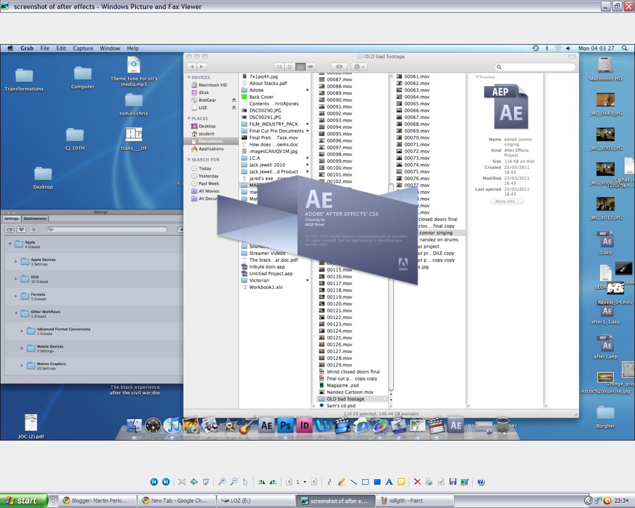
This is AfterEffects loading up and my folder in the background with all my files and saved work in.

My finished Poster! I used black and white for this because i wanted to give the band a novice sort of theme as they aren't particularly popular in real life. My poster is advertising my album and not my 'Single' from my main task, however the crocodile still features and it reads 'Featuring Stupidly Happy' just above the crocodile's head giving the main image meaning and so people understand why the crocodile is there.

This is my album cover, i used flowers as they are colourful and they suit the band's style and mood of music. I chose the album name to be 'Little Town in Sheffield' as this was an abstract sort of name and i thought i could make it sound like they were loyal to their home ground and they didn't leave their safe creche much. Also an album name like this would promote the fact that the band aren't particularly big, but they have big intentions. There is small colourful writing at the top of the cd case 'The Award Winning Album' i thought this would be a good finishing touch as it could be any award but it still looks good and its in sync with the colour code on the rest of the album case.

This is 'Final Cut Pro', a programme that i used for editting my main music video task. This programme may look complicated but it is infact very simple to use. You simply drop your desired files into the timeline bar and start your editing. You can use all different types of tools and effects. The tools you may use are located on the bottom right of the screen grab, these tools include a razor blade for chopping up video files to make them smaller and easier to use. The effects are located in more or less the same place as where you keep all you files, in the big box top left. The effects vary greatly, from page peels and cross dissolves to split up scenes, too lighting and sound effects for making you video appear smoother and better shot. There were two seperate viewing windows, one for viewing your whole timeline, and the other for simply viewing individual clips when you are deciding what to put where.

The screen grab above shows my video converter again. It also shows my 16GB pendrive that i had to use to make the transportation of all of my files possible.

This is my folder on my school computer, you can see on this small screen grab just how many files that i used and saved. Most of these files however are video clips from my original filming, there are around 40-50 different clips.

The back cover of my CD case. It may appear as if i used a very arbitrary assortment of different words. However i did think about it carefully. Each song name was there for a reason, 'Old Mine' gives the CD the effect i was talking about before, it all being very local and just a small town thing. However i thought i could also liven the Album up with track names such as Bananarama and Beige, these being names that give alot of food for thought. As you can see with the main image on the back cover i thought i might aswell follow the same theme as the front cover, it would be stupid not too, this is just an extreme close up of some flowers that i thought look beautiful and colourful.

After Effects. A programme i used for editing in Cartoony sort of bits too my final piece. I thought i could also make it look a little bit like a scrab book by adding in what looked like sellotape and also making it look like i had hurredly cut the images out with a pair of scissors. The beauty of this effect was that the clips were all obviously still moving so it looked like a sort of magical book page.

This (above) is another shot of Final Cut Pro where there is a small box in the middle that says 'Rendering', unfortunately this was one of the more annoying things about my media coursework, every time i added in a file and started editing it, it needed to be rendered, which, depending on the size of the file, could sometime even take up to 10 minutes as i was also on a very slow PC.

Last but not least, a screen grab of The effects on final cut Pro.
Planning

I originally had an idea that i could have my friend dancing in the crocodile suit in the middle of the busiest street in Jersey 'King Street', due to a few complications though this could not happen. In hindsight its probably a good thing aswell as people would just get in the way of the shot, it just wouldn't have worked.

This is a small story board showing my idea of the revolving door right at the end of my video outside the swimming pool when the Crocodile sees the water he truly loves.

A story board showing my idea to have the Crocodile driving in his car.

This shows the real technicality of the work i was doing right down to the seconds i had to fit my clips in and where i was going to put what.

There were some ideas i had that i never used, such as going to the Zoo, we weren't allowed in.. I thought this was utterly ridiculous at the time (and still do) as it was for an important school project.

As you can see here are some of my ideas, i was going to go to the gym with the crocodile and have him running on a treadmill but there are strict policies at the gym about having safe equipment, again we weren't allowed.

Here are my Story Boards with some illustrations showing how i planned my media task and showing what shots i wanted to use at what point in the video. It also shows my desired locations and destinations for my filming. Some of the things planned on my story board i never actually did due to complications.
PROBLEMS that i faced along my epic media journey of 2010 and 2011
Jersey's local zoo Durrell didn't let us in to film which ruined a very large party of my idea.
I faced numerous problems with uploading onto my school computer due to a problem with Toast which was the uploading programme that we all had to use.
The weather was often very poor in the winter so filming itself was actually a bit of an issue.
There was a part of my filming that i had planned but could not carry out because there was a group of young boys jumping and throwing themselves in front of the camera too purposefully prevent me from being able to record. This all happened outside the AquaSplash which is one of Jersey's local swimming pools. Alot of people's parents send their kids there because they have literally nothing else to do with them whilst they start some early Sunday Afternoon drinking sessions, idiots.
Sunday 27 March 2011
Evaluation
- In what ways does your media product use, develop or challenge forms and conventions of real media products?
My music video challenges the conventions of real media products and existing videos by the fact that it is nearly all narrative. Most music videos have multiple band shots and a lot of lip syncing whereas I thought it would be more useful if I used a mainly narrative approach to my music video as it is someone carrying out their daily activities dressed up as a crocodile. However my music video also follows the conventions of real media products by the fact that there is a main character, decent film shots, continuity editing an easily identifiable story line. Both of my ancillary tasks follow the conventions of real media products by having one main image and a clear, bold masthead.
My Album Case challenges the conventions of real media products by the fact that it has a fairly little amount of information, all i have used for the cover is about seven words and and the big beautiful main image.
My Album Case challenges the conventions of real media products by the fact that it has a fairly little amount of information, all i have used for the cover is about seven words and and the big beautiful main image.
- How effective is the combination of your main product and ancillary texts?
For my Ancillary tasks I believe there is a more effective combination between the poster and the music vid than the cd album case and the music vid. For the album case I have used a colourful picture of some flowers whereas for the magazine advert I have used a picture of the crocodile so it obviously links in better with the video itself. In a sense there is a great combination between by ancillary tasks and my main video because i believe the imagery and setting of my work all evokes the same theme, which would be pastoral country side kind of images for the most part. It also very obviously portrays the 'Fun' theme.
- What have you learned from your audience feedback?
I have learnt a great deal from my audience feedback, I have found out what specific people like what music and how many people like each genre. I have also learnt that I could have spent more time on planning my editing so I could have got my shots in a better order. Some of my friends said that my editing looked like it may have been slightly rushed and that I could have taken more time in deciding what I was
going to do with each shot and what meaning it would serve.
I have also learnt from my audience feedback that i could have used a guitar aswell as a vocalist and a drummer in my music video main task. After showing people my poster many were curious as to why it was in black and white, but their questions were quickly answered and i am happy that i used this technique as i have said before i believe it helps with showing the true nature of my band. XTC.
How did you use media technologies in the construction and research, planning and evaluation stages?
I used many different media programme's from photo uploaders to editting photos and videos. I greatly enjoyed developing and homing my skills at editing my music video as i can use these skills in later life for making compilations of various activities. I used a programme called Toast for uploading my video footage, this is the only programme that i actually had a distinct problem with as it was cutting out small bits of my footage so i had to re-shoot a couple of things which made continuity difficult. For my media project last year i used iMovie, this year however i used Final Cut Pro, i have now realised that final cut is simply a far more advanced programme where you are capable of many different effects suck as cartoon images and text to follow things around on screen. My favourite part of this assignment was definitely once i got editing. As i was putting all my footage together and lip syncing on final cut i realised that the project had all been totally worth it and i have also discovered an underlying love for media. I have used a video camera for a few interviews whilst evaluating my final piece and ancillary tasks, i am yet to upload the videos but this is because they are currently in the wrong format.
Planning my tasks
I organized myself well and decided to get my filming done very early so I had maximum time to edit my music video and so I wouldn’t be pushed for time close to the deadline. I enjoyed planning my task in the form of story boards. I was worried at first that I may not be able to find a dependable person to rely on for my filming but sure enough a friend helped me out and I could get going.
While planning my filming I decided that I would use many different shots and that I would film far more footage than I needed so I would have a lot to choose from. To film my main footage I used a camera that I borrowed from school after leaving a £5 deposit. I used my dad’s high quality tri-pod for steady shots and easy camera movement without making my footage look tacky and un organized.
I filmed my music video in the winter so it was hard to find any kind of decent weather which was irritating as my music video has a happy theme and the weather almost always helps to evoke the mood of the piece.
I asked my friend josh to answer a few questions about my video which I will upload in video form later on in my blog.
My teacher suggested that for the editing we should use a programme called ‘Final Cut Pro’ which was great and it helped me to be able to edit with ease, I could also use lip syncing techniques to give my video a really professional look. For my ancillary tasks I decided that I would use Photoshop on the Apple Mac because if I used this it would enable me to be able to chop and change my original photos to make them look brighter, higher quality, and just generally different.
Tuesday 22 March 2011
Planning The Main Task
In the planning of my main task i designed story boards so i could plan out the different shots i was going to use and so i could get some idea of what would go where and how long my clips and video would have to be so it could all fit together nicely. I felt that my planning stage went well and that it helped me in understanding some of the computer programmes for both Windows and Apple Mac. I completed two story boards for my first idea, but these became useless as i then went on to change my idea to a completely different subject and song.
I started out by filling out a story board (by hand) for my new idea, a normal guy waking up and starting to prepare for a normal day, but then suddenly being overcome by a happy sort of sensation. I believe that the crocodile suit that features for most of my video resembles the mans happiness and joy.
I had a lot of fun shooting my video as me and my friend got many funny looks and comments regarding the strange and colourful crocodile suit as we walked through a sometimes very busy town on a Saturday afternoon.
Tuesday 15 March 2011
Target Audience Questionnaire Results
For my target audience i handed out questionnaires so i could get some real and accurate results that would benefit me in finding out a few extra things for the making of my music video.

I handed out a questionnaire to a class of year 10 students at my school. Around 15 of them actually bothered to fill out my questionnaire and so here are my results in the form of a pie chart.
Thursday 6 January 2011
Filming
For my filming i had to find a friend that would commit many hours of their own time into filming all the different shots. For this i used Connor-Jay Hughes as i knew he would be loyal and I could depend upon his assistance. Many of the ideas i had would take courage and confidence on his behalf and his help ended up being priceless, my filming process wouldn't have been the same without him. Thank you Connor.
Monday 27 December 2010
Analysing Music Magazines

Q Music Magazine
By the large bold text and the colours on this front cover it already becomes relatively obvious what the genre of magazine is. This magazine strikes me as an Indie/Rock magazine, the names of the Bands/Artist help to inforce this opinion. The main image consists of a young man, possibly in his late twenties that despite wearing a suit still manages to look scruffy. Importantly the barcode is in a relatively inconspicous area of the magazine and so it doesn't take up valuable space of the A4 sized front cover.
Update
So far I have found that planning my my music video has taken the most amount of time. I have a good idea of what I want to do but planning every second of the video has proved time consuming and difficult. I have made several story boards, most have been drafts however i am almost finished my planning now and will be going out to film very soon. My music video will basically consist of a dancing crocodile brightening up people's lives and making them feel happy. I have planned on using a great variety of different shots ranging from high to low angle and from panning to close up. So far I have greatly enjoyed this years A2 media project and believe by the end I hope I shall feel enriched and far more knowledgable over many areas of the Media subject.
Monday 8 November 2010
Feeder Echo Park

A strict colour theme has been used on this album cover (blue/purple). With an obvious masthead and font that is typical of Feeder. This main image is open to interpretation as it is unclear as to what is going on. The Masthead being in white stands out from the contrasting colours of the rest of the album cover. The main image may give some indication of the genre of the music which I believe judging by this cover would be Rock or possibly Indie.
Thursday 21 October 2010

Monday 18 October 2010
CHANGING IDEA BACK TO MUSIC VIDEO SEE THE START OF MY BLOG FOR EARLIEST POSTS
I have decided that I am going to change my idea back to music video due to a lack of resources that would have been needed for my original idea to do a lego film teaser trailer.
I have finally decided to do a music video for the song 'Stupidly Happy' by XTC, realised in 2000.
I have finally decided to do a music video for the song 'Stupidly Happy' by XTC, realised in 2000.
Wednesday 29 September 2010
Analysing 300 Teaser Trailer

The Start of the 300 Teaser Trailer obviously defines the genre of the film as action/adventure due to the swords, shields and general fighting. This is a very strong establishing shot as there is such violence and destruction. There is a darkish colour theme with sunlight shining through the armour of the soldiers, strangely however the sunlight is shining in the background of the enemy soldiers. The shot above is more or less the establishing shot in the Teaser Trailer showing the sort of landscape and whats going on (cliffs/fighting) .


Link to Shaun Of The Dead Teaser Trailer: http://www.youtube.com/watch?v=BXyLlpLnq6w

The trailer kicks off with a very important message "our nation is in crisis" as one may expect this to be a comedy film this is a worrying first message. There is no specifically obvious establishing shot as the trailer starts off with a sort of broken TV creating a spooky feeling as there is something wrong with the network (this may be spooky as in many horror films suspense is created by an electricity cut or something along those lines). To straight away show the 'Shaun' is an average man there is a framed picture, some wooden furniture and Shaun in the reflection of the TV in his work clothes. It quickly brakes onto a blurred image of an ambulance giving the viewer the feeling that something isn't right. Very quick shots of strange deformed people show up on the screen. "A state of emergency has been declared" the viewer is on edge and doesn't know what's going to happen.

As soon as the camera cuts onto the two main characters the trailer is transformed back into a sort of comedy film due to the facial expression and general mise en scene. As the trailer progresses Shaun's actions become more and more stupid really drilling in the comedy theme, thus specifying the target audience.

Shaun flying over a Garden fence.
Analysing Transformers 2 Teaser Trailer
Link to youtube video: http://www.youtube.com/watch?v=maPFhlFfJG8
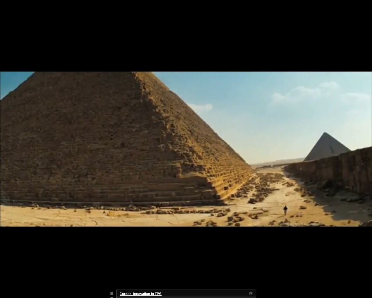
This Teaser Trailer is a very useful first example as it gives an obvious idea of the genre of the film and small parts of the story without giving anything major away. Throughout the whole of the trailer they use snappy short cuts to give suspense to the trailer and also to give a Sci-Fi futuristic kind of feel to the film. Here you can see one of the first little cut scenes from the teaser trailer, a desert and a large pyramid, this is useful as the viewer will wonder how much/what part of the film is set in this desert. They have also shown a person at the foot of the pyramid to show what a monumental structure it is.
The Teaser Trailer often fades out to a pure black screen again giving the trailer a strange suspense and also giving a technology theme to it. Cutting in and out like in the trailer is a modern technique thus why it's evoking technology. I won't show a screen shot of the black screen as I would hope it isn't too hard to imagine.

As you can see there is a sudden change of place in the trailer (in fact there are shots in this trailer from all over the world) once again showing how the film is modern and may be based upon something technologically advanced. Meteors are associated with outer space thus giving another idea on what the film will be about/what to expect. This specific snap also gives the viewer a good idea of good and evil in the film, as the ships are reasonably brightly coloured and the meteors are leaving a trail of black smoke associated usually with something of bad intention. This shot is also taken from a sort of plan view minimalising the ships. The aircraft carrier is the largest ship in the US navy and with it appearing so far away with the meteors looking so big it already seems that there is no hope. Just like the last however this shot cuts out quickly onto a black screen and the music fits in perfectly with the time of the cut. The audio in this Teaser Trailer is stuttering and jumps quickly from loud to quiet again following the technology theme.

My third screen shot of the Transformers 2 Teaser Trailer shows nothing but actions and explosions. The picture (as its fairly difficult to tell) is showing a giant alien robot rolling out the side of a building being pursued by three smaller robots. Once again this part of the trailer being in a completely different part of the world (Japan), I believe this is a selling point as the more places in the world they include in the trailer the larger the target audience. One may be able to tell this is in Japan by the shot just before this and the writing on the wall to the left. The reason so much action is shown in the trailer is because that's what Transformers is all about and that's what will suit the target audience.
Tuesday 28 September 2010
Analysing Harry Potter film poster
.jpg)
As well as The Lord Of The Rings poster this one has a very dark theme which suggests of an eminating evil entailed in this film far down the Harry Potter order. The character in the main image is evidently holding a wand (wizards and witches) which informs the viewer of the films genre (fiction/action). As you can see in this poster Harry Potter is fading away into darkness and his only source of life is his magic wand which is creating some kind of small glowing orb. This one image I believe effectively sums up the entire film, Harry is the final hope for wizarding survival which is resembled here by the small glow coming from the end of his wand (no inuendo intended). They have used an interesting font for the text on this poster, the font gives a kind of retro yet futuristic feel, the font also seems to gleem with hope again suggesting how the main character is unique and may carry the key to survival. Also questions may be raised as to how it is possible for someone to be Half-Blood, is this some kind of magical connotation, does Harry have some strange power from being only half human? The Mise-en-scene of this poster gives us a strong impression of the film's genre by the fact that the main image is holding a wand, the clothes however suggest otherwise as they are rugged and old. The makers of this poster have also effectively used pathetic fallasy (the weather is basically setting the scene). "Coming Soon" is a faded text giving us the idea that it isn't an important piece of information, the fact that it's faded may also resemble the films completion date and as it's faded this will suggest that the film isn't ready yet.
Analysing Lord Of The Rings film poster

As one my favourite films Lord Of The Rings is a great interest of mine. This poster has a very gloomy theme to it with most of the poster shrouded in mist and fog helping the Masthead to stand out where it has been placed. As the sequel to the Fellowship Of The Ring, The Two Towers has a rather mysterious name to those who haven't already read the book. The Poster contains two towers, one which is far larger (Mordor) this suggests that the film may be based around this which it subsequently is (as all the films are). As a symbol of great hope Gandalf (top left character on the poster) is pictured wearing gleaming white. Saruman (a traitor and evil character) is situated in the bottom right next to the other tower (Isenguard), this is useful because a great part of the film is based upon Saruman's actions. "The Journey Continues" ellement of mystery for those who haven't seen the fellowship. The fact that all of the characters are in between the two dark towers (in the poster) symbolises their weakness, the characters facial expressions also symbolise fear and weakness.
Monday 27 September 2010
Analysing Forgetting Sarah Marshall Poster

As you can see by the poster the film is a romantic comedy. You can see that it is a romantic film by identifying the large shape in the middle as a heart and you may be able to tell that its also a funny film by the Poster's layout and "From the Makers of The 40 year old virgin and Knocked up" These are also romantic comedies giving the impression that the producer is into making that kind of film. The large split in the middle of the heart suggests that the man is being metaphorically pulled apart by two women who both may be fighting for his heart. However it could also evoke his own indecision. As you can probably see by the man's entire, he seems confused as to what he's doing by the fact that he's wearing a colourless pair of trousers and flip flops. This also may inform us of an exotic twist in the film as well as his flowery necklace and the colar of his colourful shirt. The more important information on the poster is seperated by the fact that it is written in a different colour. The celebrities that star in the film are also easily noticed by the large white font that stands out against a blue background, naming the celebrities on the poster is an obvious selling point as having heard of these celebrities it will draw the viewer in.
Thursday 23 September 2010
The Hurt Locker film poster analysis

Monday 13 September 2010
Analysing Film Posters
| Transformers 2 Film Poster This Poster is useful as I believe it successfully portrays (or at least gives an idea) of the films genre (action/sci-fi fiction). The Poster's masthead is bold and they have used a technology-themed font with smaller type beneath conveying information of less importance such as the director/co-producer, etc. Another useful thing about this poster is the fact that it basically sums up the film with a single picture, a giant alien with a big gun, once again obviously targeting youth/a younger audience or people that grew up watching Transformers or reading the comics. 'Experience it in IMax' this would be an obvious tactical selling point as people will associate a film as such with being of greater excellence with better graphics/quality. As transformers is very action based many people will travel to see it purely based on their love for action and this will subsequently lead onto CGI and special effects. I will move back onto the main image as I am starting to side track from the actual content of the poster. Behind BumbleBee (the robot as the main image) we can clearly see a pyramid which will lead an adventurous and creative mind onto thinking about MORE action. Could Michael Bay really wish to go as far as making giant Alien Robots destroy giant ancient pyramids? My question here would be one that would have been playing in most minds after a glimpse or two at this poster. Also as the pyramids are of massive historical importance to the inhabitants of Earth this may attract more questions about CGI and how it is possible to render a 3D pyramid (being blown to pieces) merely using a computer, thus increasing anticipation levels once again. I believe the main reason that this poster got away with one main image is because of Transformers' current and existing popularity. Who didn't know about transformers before the Michael Bay production of 'Transformers' (1). Obviously there is reason behind the main image being 'BumbleBee', as Sam's loyal and faithful Robot 'BumbleBee' plays a large and main role in transformers and much of the already massive target audience will already know of this character. As you can probably still see from this small image Michael Bay has decided upon an enticing and gripping name for the already popular and well awaited sequel 'Revenge of the fallen', if somebody looking at this poster hadn't seen the first 'Transformers' they would want to now to know who 'fell' and what the revenge is all about and so forth. I think a useful feature about this poster is that the sun is in the background of said Robot and it is minuscule, leading the passerby of this poster onto thinking about extra terrestrial life and how our star has just been dwarfed by a big robot. |
Wednesday 23 June 2010

Gorillaz are the name of this band and they have used strange cartoon images to reflect their genre in an abstract and unordinary way, the cartoon images themselves actually resemble a family of gorillas slightly. The target audience for this band are teenagers. This album cover has an obvious masthead and follows the conventions of a standard Music album with its title and main image on the front cover.


'The Beatles' have a warm and energetic album cover. The Album cover is full of life, it shows the Artist and Album name and all four members of the band in the colour red emphasizing their presence. As the album name is 'Love' it would be out of context to use bland life-less colours. Yellow, Red and Orange create a good mixture of easy-to-see, obvious and welcoming colours making the album cover's artwork easy on the eye yet interesting and original. The name of the album suggests that this is not 'The Beatles' first album, they were a great band that were known for experimenting with their music and lyrics, thus pushing the musical boundaries. The language on the CD cover relates to the imagery that is used in it's style and theme.

With some of the techniques 'Pink Floyd' used in the making of this album it rapidly became one of the most ground-braking albums ever made. One of the most striking features of this album in itself is the art-work as it is so plain and ordinary, yet openly intriguing and somewhat original. The triangular-prism reflects light off at an un-expected angle therefore drawing the viewer in and giving an irregular theme to the cover. There is no real obvious masthead on this Album cover due to the only writing being obscure and small. 'The Dark Side of The Moon' retains a dark, plain colour theme mirroring that of the actual dark side of the Moon (the Moon being mysterious and unexplored).
Tuesday 22 June 2010
Research into Similar Media Texts

Subscribe to:
Posts (Atom)