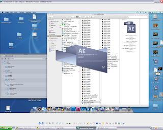
I screen grabbed these shots of a mac at school but they wouldn't upload straight onto my blogger so i ended up having to screenshot them again on my desktop at home. Which is why it looks like a Mac screen and a Windows Desktop screen at the same time. I will list some of the programmes here to give you some insight of what i used and how i used it.
After Effects: An Apple Mac Programme that i used whilst editing some of my clips.
This is the converting programme i used so i was able to make my file small enough to put on youtube. The programme was simply called 'Converter'.
This is AfterEffects loading up and my folder in the background with all my files and saved work in.
My finished Poster! I used black and white for this because i wanted to give the band a novice sort of theme as they aren't particularly popular in real life. My poster is advertising my album and not my 'Single' from my main task, however the crocodile still features and it reads 'Featuring Stupidly Happy' just above the crocodile's head giving the main image meaning and so people understand why the crocodile is there.
This is my album cover, i used flowers as they are colourful and they suit the band's style and mood of music. I chose the album name to be 'Little Town in Sheffield' as this was an abstract sort of name and i thought i could make it sound like they were loyal to their home ground and they didn't leave their safe creche much. Also an album name like this would promote the fact that the band aren't particularly big, but they have big intentions. There is small colourful writing at the top of the cd case 'The Award Winning Album' i thought this would be a good finishing touch as it could be any award but it still looks good and its in sync with the colour code on the rest of the album case.
This is 'Final Cut Pro', a programme that i used for editting my main music video task. This programme may look complicated but it is infact very simple to use. You simply drop your desired files into the timeline bar and start your editing. You can use all different types of tools and effects. The tools you may use are located on the bottom right of the screen grab, these tools include a razor blade for chopping up video files to make them smaller and easier to use. The effects are located in more or less the same place as where you keep all you files, in the big box top left. The effects vary greatly, from page peels and cross dissolves to split up scenes, too lighting and sound effects for making you video appear smoother and better shot. There were two seperate viewing windows, one for viewing your whole timeline, and the other for simply viewing individual clips when you are deciding what to put where.
The screen grab above shows my video converter again. It also shows my 16GB pendrive that i had to use to make the transportation of all of my files possible.
This is my folder on my school computer, you can see on this small screen grab just how many files that i used and saved. Most of these files however are video clips from my original filming, there are around 40-50 different clips.
The back cover of my CD case. It may appear as if i used a very arbitrary assortment of different words. However i did think about it carefully. Each song name was there for a reason, 'Old Mine' gives the CD the effect i was talking about before, it all being very local and just a small town thing. However i thought i could also liven the Album up with track names such as Bananarama and Beige, these being names that give alot of food for thought. As you can see with the main image on the back cover i thought i might aswell follow the same theme as the front cover, it would be stupid not too, this is just an extreme close up of some flowers that i thought look beautiful and colourful.
After Effects. A programme i used for editing in Cartoony sort of bits too my final piece. I thought i could also make it look a little bit like a scrab book by adding in what looked like sellotape and also making it look like i had hurredly cut the images out with a pair of scissors. The beauty of this effect was that the clips were all obviously still moving so it looked like a sort of magical book page.
This (above) is another shot of Final Cut Pro where there is a small box in the middle that says 'Rendering', unfortunately this was one of the more annoying things about my media coursework, every time i added in a file and started editing it, it needed to be rendered, which, depending on the size of the file, could sometime even take up to 10 minutes as i was also on a very slow PC.
Last but not least, a screen grab of The effects on final cut Pro.


No comments:
Post a Comment